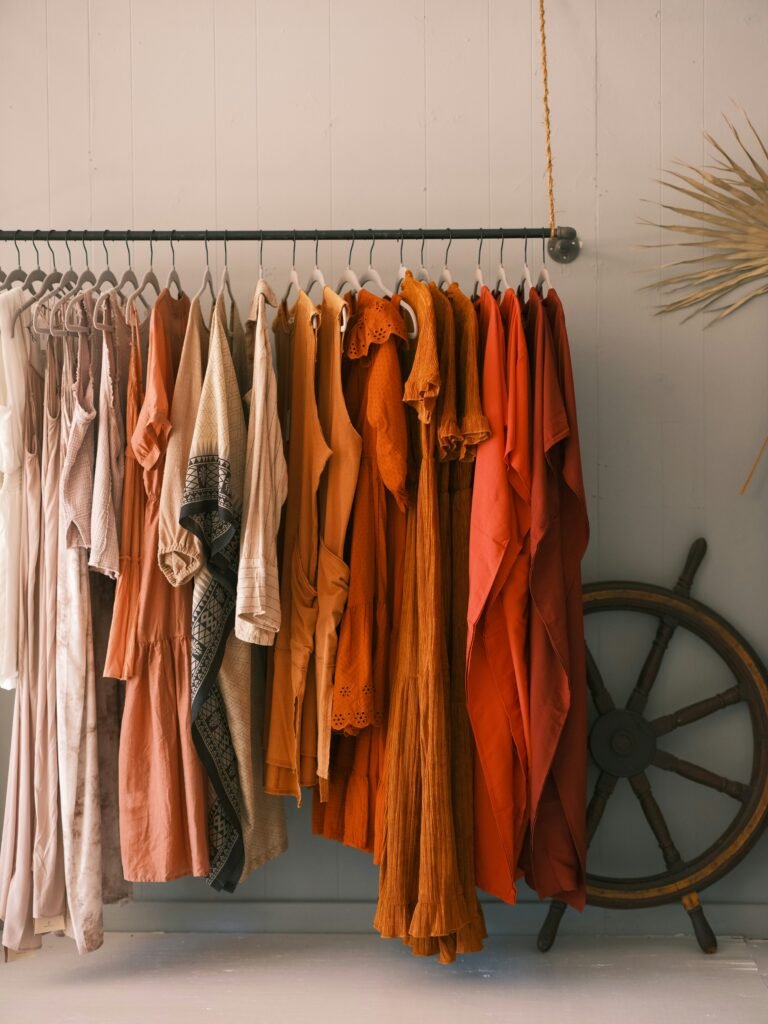
If you’ve been told you’re a “Dark Autumn” in seasonal color analysis, congratulations ! You belong to one of the richest, moodiest, most sophisticated palettes out there. Dark Autumns have deep, warm, and muted coloring, and the right wardrobe colors can make your features look luminous rather than washed out.
Best Colors for Dark Autumn
Deep Neutrals
- Espresso brown : a foundational neutral that reads as elegant rather than flat
- Charcoal with warm undertones : a smart alternative to true black
- Deep olive : works almost like a neutral for this palette
- Warm black (soft black, not stark blue-black) : can work in small doses, especially near the face with a warm accessory
Rich Earth Tones
- Rust and burnt orange : a signature Dark Autumn color that adds warmth without looking costume-y
- Pumpkin and terracotta : especially flattering in outerwear and knits
- Chestnut and mahogany : beautiful in leather goods and layering pieces
Deep Greens
- Forest green : one of the most universally flattering colors for this palette
- Moss and olive green : grounding, wearable, and versatile
- Deep teal : bridges green and blue in a way that stays warm enough to work
Warm Jewel Tones
- Deep mustard and gold : far better than pale or icy yellow
- Burgundy and deep wine red : a go-to for a polished, statement look
- Bronze and copper : excellent in metallics and accessories
Deep Blues (Used Carefully)
- Deep teal-blue or petrol blue : as long as it leans warm rather than icy, this can work beautifully
Colors to Avoid
Dark Autumns generally look best avoiding colors that are too light, too cool, or too bright:
- Pastels (baby pink, powder blue, lavender) tend to wash out the depth in your coloring
- Icy or true jewel-bright tones (fuchsia, electric blue, true red) can clash with your warm undertone
- Stark black and pure white often create too much contrast against warm, deep coloring — soft black and warm ivory are better substitutes
- Neon or fluorescent shades overwhelm the muted quality of this palette
REMEMBER : It’s all about depth, warmth, and richness. Think of the colors of a forest in October : rust, olive, burgundy, and bronze. Reach for something that looks like it was pulled from the natural, earthy end of the color wheel, and you’ll be dressing in true harmony with your coloring.